KavaChart in Action - Examples and Documentation - ProServe
[ Back ] Timeseries Charts - Date Bar Charts
|
Bar charts are ideal for comparing categories or discrete events against a common
scale. In KavaChart, bar charts with vertical bars are called "column" charts,
while those with horizontal bars are called "bar" charts.
Bar charts are particularly good at highlighting the differences between items. In general, the conventional bar and column charts (barApp, stackBarApp, columnApp, stackColumnApp) do a much better job than timeseries bar charts. If you need to show trends, a line chart or area chart variant might be a better choice. KavaChart ProServe's Timeseries collection includes the following bar and column charts:
|
|
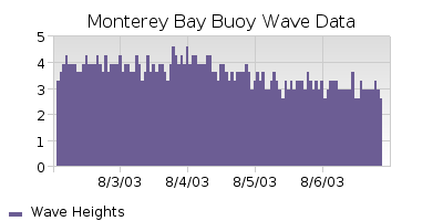
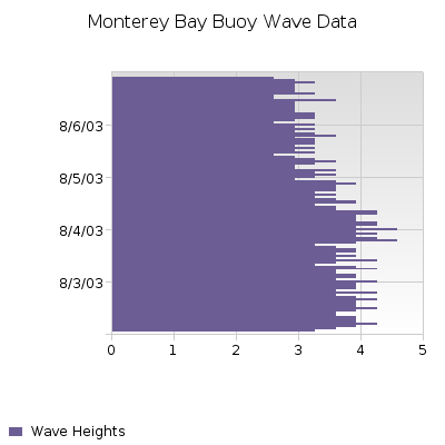
Even though bar charts are best for comparing discrete items, it's possible to use them in a similar fashion to line and area charts for viewing trends. In particular, the bar and column objects that begin with "date" (dateBarApp, dateStackColumnApp, etc.) will arrange bars along a time oriented axis. In this case, we also adjusted the "barClusterWidth" parameter to make adjacent bars touch. The effect is similar to a step chart. Time oriented bar charts should only be used when you have more than 20 observations. Fewer observations are better compared as discrete items. |

|
|
In KavaChart parlance, a "Bar Chart" has horizontal bars, while a "Column Chart" has vertical bars. |

|
|
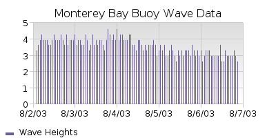
If you really need a bar chart with a timeseries axis, consider using a stick chart. By default, this chart uses a bar width of 1 pixel, but you adjust this with the "stickWidth" property. Since time data usually isn't distributed evenly across an axis, a stick's narrow width makes axes work better, and often looks better than actual bars. |

|
