KavaChart in Action - Examples and Documentation - ProServe
[ Back ] Specialty Chart Collection - Radar Charts
|
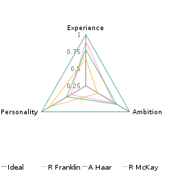
Kiviat, Polar, Radar, or Spider charts give you a visual comparison of several items, usually
without regard to a specific numeric scale. For example, lets say you wanted
to compare several individuals to see who was best suited for a particular position.
A spider chart lets you rate several attributes against an ideal, and get
an instant visual comparison of any individual against the ideal candidate.
KavaChart's collection uses "polarApp" for drawing Radar charts. |
|
A simple spider plot has one "spoke" on the axis for each item compared. The user-defined axis labels are positioned at the end of each spoke, and numeric labels are drawn on the vertical spoke at the 12 o'clock position. With a Kiviat chart, all the values are typically normalized to a specific range, generally from 0 to 1. The shape of the various datasets can be compared with the ideal at a glance, which is the goal of this kind of chart. Each dataset should have the same number of items, and each item's value should fall within the same range. KavaChart spider plots are implemented with the object "polarApp", which can also be used for polar charts. |

|
|
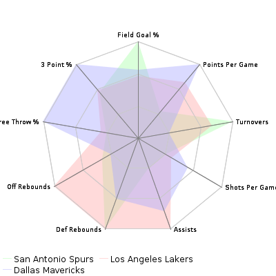
This spider plot compares several NBA teams. At a glance, we can see which teams take the most shots per game, which team has the best free throw percentage, and so on. Since these values all have different ranges, we normalized the values to a number between 0 and 1, and then set the axis to scale from -0.5 to 1 to keep the dataset shapes roughly circular. Kiviat charts can also display markers at each points, and can toggle the visibility of the plot lines for a sort of scatter plot display. This is more effective when the axes are reduced with the "numSpokes" param, or when the axes are hidden by setting the color to "transparent". |

|
|
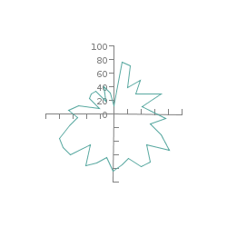
With a much larger number of points and a fixed number of axis spokes, a spider plot takes the appearance of a radar plot. KavaChart's polarApp always distributes the points in a circular distribution around the center of the plot, but you can vary this behavior in a variety of ways with a little bit of Java programming. See the "contrib" item "dailyPolarApp" for an example object that uses this object to create a 24 hour "clock" of values. |

|
