KavaChart in Action - Examples and Documentation - ProServe
[ Back ] Finance Chart Collection - Sector Maps
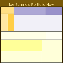
| A Sector Map consists of colored rectangles grouped by dataset. Each dataset has rectangles of an area proportional with their Y values. The color is based on the X value. This kind of chart is sometimes called a Treemap. |
|
While Sector Maps can be used for a variety of purposes, they're very handy for reviewing a financial portfolio. Each dataset can represent a market segment, and each item within the dataset represents the value of a security in that segment. The color represents the price change. At a glance, you can see where your money is allocated, how your stocks are faring right now, and whether an individual stock's performance is related to the entire sector, or is some kind of anomaly. You can also place hyperlinks on each rectangle that let users drill-down to additional information. We switched this image type to "Flash" with a property, but it can be produced in any of ProServe's output formats. |

|
