KavaChart in Action - Examples and Documentation - ProServe
[ Back ] Finance Chart Collection
KavaChart ProServe's collection includes the following simple finance charts:
Visual Engineering's consulting group has also created customized finance charting applications with full technical analysis, either in interactive Java applets or server-side charting. Contact us at consulting@kavachart.com for more information about how we can save you time and money building a completely customized financial charting solution. |
Candlestick charts are used in finance applications to combine a lot of information at a glance. The top and bottom "whiskers" on the candlestick show the high and low value for the day. The open and close values are shown by the center box. Depending on whether the box is solid or hollow, you can tell at a glance whether the opening price was higher or lower than the closing price. |
|
This chart uses a simple set of params to create a readable and professional style. Data comes from special params used by candlesticks and OHLC: dataset0HighValues, dataset0LowValues, dataset0OpenValues, and dataset0CloseValues. You can also read your data from a URL or file, using the "customDatasetHandler" param. The file or stream at this location should contain 5 columns: dates, high, low, open, and close values. Date values are defined with a timestamp string. Use "inputDateFormat" to describe the format of the string to the server object. In this sample, we're using "yyyy-MM-dd", which is appropriate for our dates, which look like this: "1999-06-01". Although the data in this sample is fixed, you will probably use a database or web service to provide your data. See our tag library and scriptlet coding examples to see how to do this. |

|
|
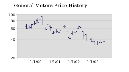
Another variant of this type of chart is the OHLC chart, implemented with hLOCApp. This chart uses a left and right whisker to indicate open and closing prices. Some technical traders like to use the various whisker positions to help them predict price movements. Like the candlestick chart, an OHLC chart provides a lot of information at a glance: trends, specific period high-low-open-close price data, and volatility for a particular period. When examining these trends over a long period, a log axis is sometimes appropriate, since investment values compound exponentially. We used a logarithmic axis on this chart, even though it's not really called for by the actual data. |

|
|
Since you can combine several applets into a table, sometimes the most convenient way to build a typical price/volume finance chart is to combine a couple of applets into a table like this. Any number of indicators can be combined into a series of charts with the same style and scaling. If you want to combine multiple indicators into the same chart window, use KavaChart's kcfinance package or one of our combination charts. |


|
|
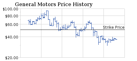
For example, this combination uses KavaChart's OHLC applet, together with a variant of bar charts called "stickApp" to create another typical finance chart style. We also added a reference line on the price chart at $50, and changed the labels to currency labels using other applet params. |


|
