KavaChart in Action - Examples and Documentation - ProServe
[ Back ] Basic Charts - Bar & Column Charts
|
Bar charts are ideal for comparing categories or discrete events against a common
scale. In KavaChart, bar charts with vertical bars are called "column" charts,
while those with horizontal bars are called "bar" charts.
Bar charts are particularly good at highlighting the differences between items. If you need to show trends, a line chart or area chart variant might be a better choice. KavaChart ProServe includes these bar chart styles:
|
This page uses chart tags with in-line properties, rather than external style sheets. While this probably
isn't an optimal coding style, you can see how we're creating these charts by simply looking at the JSP
source code.
You can also use the KavaChart
ChartWizard
to design your own bar charts.
|
|
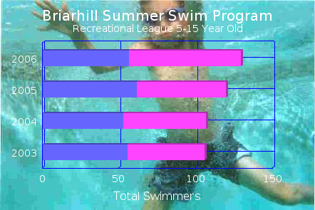
This chart definiton illustrates at a glance what the makeup of a youth swim team looks like for several years. In addition to comparing the total size of the team, the chart illustrates the team composition by gender. A chart like this is a "stacked bar" chart, because the dataset values are stacked, and the bars are horizontal. The chart type is "stackBarApp". Placing your mouse over a bar in the chart will show what the actual data values are for that item. The format of the numbers is defined using a chart style property. An image background makes the chart more interesting. Images can be used for any filled chart object: backgrounds, plotareas, even bars. It's usually a good idea to use a muted image to avoid distracting from the chart's data message. |
|
|
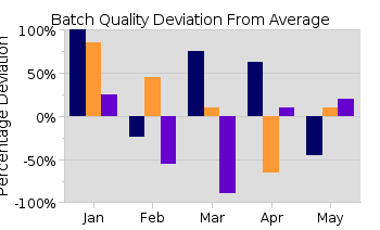
In this sample, we use a baseline value of 0 (the default) to show bars ascending and descending from an expected value. This gives us a side-by-side comparison of 3 different series in 4 different months, and tells us at a glance what the status is for a particular production line. Y Axis Percentage labels automatically describe the values in a way appropriate for the page viewer. Tooltip labels give exact values for each bar. Bar baselines can be set at any value. This chart uses "columnApp", vertical bars that are grouped instead of stacked. |
|
|
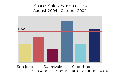
Sometimes the simplest chart is best. This bar chart uses "columnApp" with the parameter "individualColors" set to "true". Individual colors make comparisons among bars of a single dataset stand out. For even more simplicity, we removed the Y axis except for the grid lines, and added a reference line at the goal level. This gives an additional level of information - at a glance you can tell which stores exceeded the sales goal. Any bar or column chart can have individual colors and any axis can have reference lines. Since there's not enough room for the labels, the bottom axis automatically staggers them to prevent overlap. |
|
|
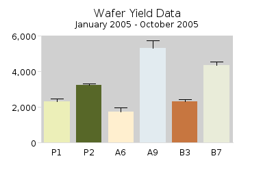
Bar/column charts can also be used for scientific work. If you organize your raw data into a histogram, a "columnApp" will display the histogram values correctly. Similarly, a Pareto chart can be created by sorting raw data. See the tag library usage samples for some examples of using built-in data manipulation tags. You can also add "error bars" to any bar chart by adding Y values to the chart. Here's an example: |
|
|
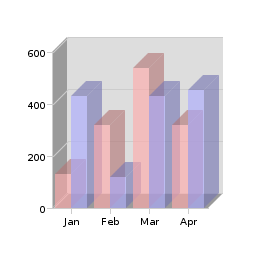
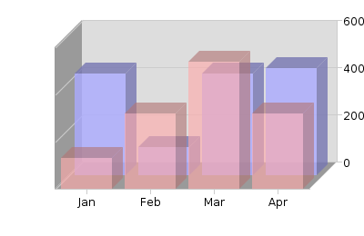
The last two charts use bars that are partially transparent to provide an interesting visual effect. You can define any color to be partially transparent with ARGB hex numbers. This format looks like this:
aarrggbb
Where the "aa" is a hexadecimal number ranging from 00 (fully transparent) to ff (fully opaque), and "rr" is the red component, ranging from 00 to ff, gg is the green component, and bb is the blue component. The second chart also uses a type of 3-d layering that looks interesting, but should be used with caution, as it tends to obscure your data. |
|
